Sunday, November 7, 2010
My ideal job
Like most people, when I go to work every morning, I want to enjoy what I do. Thus, as an avid sports fan I think it would be great to work with athletes and promote the sports I love to watch. I could definitely use my own insights to my advantage, and for me it would be a lot easier of a task to advertise the NBA rather than generic medications. Therefore, based on advertisements I've seen, research I conducted, and their client list, I think I would enjoy working at Wieden+Kennedy - most well known for their work with Nike. We are all familiar with the iconic tagline they created, "Just do it." I enjoy the satirical, humorous ads they produce for ESPN, particularly the behind the scenes operations at the ESPN offices and their Arnold Palmer spot. Their behind the scene ads feature well known athletes in uniform in the actual office. "This is Sportscenter" "Arnold Palmer"
I think these ads are good because it highlights the ESPN network by showing the consumer the in-depth information and breaking news they provide for sports fans in a funny, fictional way. A majority of their ads feature celebrity endorsements, also very appealing to the consumer.
Sunday, October 24, 2010
Long Copy and Guerilla
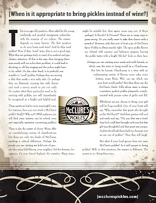
This advertisement for McClure's pickles is eye-catching because you immediately notice the white space which resembles a wine bottle, along with McClure's label. Thereafter you go on to read the headline which reads, "When is it appropriate to bring pickles instead of wine?" From the headline I get the sense that as I read more I will get some reasoning behind why I should substitute pickles instead of wine when going to a friends/neighbors home. Some of the reasons included, wine is cliche, there are so many types and you might not bring the right one, they may need a salty side dish if they are running behind schedule, etc. According to the article, the only case in which you should bring wine is if your store doesn't have McClure's. All in all, the copy is fun and tries to brand pickles as a substitute for bringing wine to your neighbors dinner. I like what the ad is trying to do and I think the image (white space) definitely catches my eye and encourages me to read the ad.
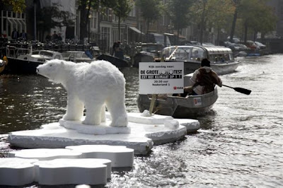
This advertisement definitely catches the eye of passer bys. My only worry would be about the limited reach if its in the water. However, people walking by who see this polar bear who clearly shouldn't be there, instantly begin to speculate. The ad aims to build awareness for VARA TV program in Amsterdam, and the issues with climate change of course. This works because polar bears definitely don't belong there so people instantly realize they need to begin changing their habits. This ad strikes peoples emotions because polar bears are viewed as "cute" animals. I think this ad will inspire people to tune into the program and at least raise more awareness of the effects of issues like global warming.
Sunday, October 3, 2010
Word.
This advertisement is from Germany. The adjectives describing the burger are also creating an image of a burger. Some of the translated words include: pleasure, taste, delicious, smacking, and delicate. I like it, and I don't like it. What I do like is how the shadow underneath the burger says "taste is king." The message they are trying to convey is clear, "come to Burger King and be treated like a King." I think it is interesting how the different words represent different ingredients, and it even includes sesame seeds. However, I think that some type is hard to define. Maybe if I was fluent in German I would be able to distinguish it more easily though. Also, the adjectives all describe the burger but, the image doesn't look to appealing, it looks play-dough or rubber.
This ad for Gorilla Super Glue is clever, but I think could be done more effectively. This advertisement is from Spain so at first I didn't realize what Gorilla was but I'm sure it is a well-known brand in Spain. The advertisement combines two words to symbolize the power of the product. I think they could have used a better relationship rather than water and oil, or things that can actually be glued together.
This ad is for Prajwala, an organization in India against prostitution. Besides the fact that they spell prostitute wrong (prostitite), I think it is great. It effectively tells prostitutes themselves the consequences of the business, but it also speaks to Pimps. On the bottom it says, "A [Prostitute] only becomes one when you hire her." which tries to convince Pimps of the immorality of the business. Overall I think the message is really strong, but the fact of the matter is, Pimps most likely won't change their minds because of these ads, but this may help steer women away from it.
Sunday, September 26, 2010
Outdoor Ads
This advertisement, released in Israel last month is clever and simple. I like how they incorporate the brand logo into the advertisement to illustrate how McDonald's has changed. Despite what many people think, McDonald's menu has food for you that is NOT THAT BAD and people who wear medium sized clothing do in fact eat at McDonald's. The tagline is simple, "McDonald's, it's not what you had in mind..." because in Israel they have altered the menu to offer food with much less calories and fat. With outdoor advertisements, simplicity is always important because consumers only have a few seconds to view the advertisement, so it is difficult to make those few seconds last a lot longer in the consumers mind. I especially like it because, billboards are very prevalant on highways so this McDonald's ad may persuade drivers on long trips to take a quick and now healthier stop.
This advertisement is interesting, I like how they use the technique of showing the effect. The billboard seems to be damaged as if the cars were in an actual accident due to tailgating. The short tagline "Tailgating isn't worth it" directly gets the point across to the audience. I think it is clever to show the effects to drivers, while they are actually driving. Otherwise it may not be as effective if you show it on television because when they go to drive again, they may have already forgotten the advertisement.
This is an advertisement called "Magic Door" and was done for Senac University. I think it is interesting to advertise on a door, where I'd assume many people walk through each day. It is a technical school and on the bottom of the ad it reads, "BE THE MAGICIAN" and "A technical course in magic for recreators." As you can see on the side, a person is pretending he is actually doing the magic trick, which could be fun and interactive amongst many more people. Also, with smart phones like the Droid, consumers who don't know what the ad is promoting, can instantly find out with apps like Google Goggles. After taking a picture, the application matches it with related links through Google's web base.
Sunday, September 19, 2010
Visual Solutions
This advertisement is simple, yet very effective. If you look closely, you'll notice a hand showing the peace sign. Then you look to the bottom of the ad and see the hand in the camera up close, with the words 24X and zoom optico. The camera apparently has zoom-in capabilities like binoculars. I like the ad a lot because this is an important feature I would consider when buying a camera. Whenever I go to football and baseball games I always take a picture on my cell phone and this advertisement is telling me that with the samsung camera, I can now zoom in and see my favorite players up close.
You would think that trying to advertise a product without using any words would be difficult, but I think this ad is brilliant. The Duro lock is still on the shredded locker, which was obviously harder to break into than just cutting up the locker. The reason this is effective is because shredding a locker is not easy. So unless someone can inconspicuously break into your locker with some power tools, you have nothing to worry about.
We're all familiar with kit-kat bars, and there slogan "break me off a piece of that kit-kat bar." The shocking/bizarre image catches your attention, and then you see their slogan, "Have a break. Have a kit-kat." However, other than the fact that the human is split, and kit-kat's split, it doesn't really compel me or make me feel as if I want a kit-kat bar right now. The person seems to be in pain as well. You can also notice little bits of chocolate flying around, like the person is a giant piece of chocolate, but the piece of chocolate doesn't seem too appetizing.
Sunday, September 12, 2010
Still a virgin? This ad really won't help...
I'm sure many of you have seen this ad on Erie Boulevard. This shocking, yet engaging billboard has been launched in many cities across the country, and unsurprisingly have stirred up many controversies. So what is this advertising? The Virginity Hit, is a new Will Ferrell movie. The billboard definitely engages consumers by giving them a "call to action." You can either call the toll free number or visit the website. Because so many people are using smart phones, I believe the billboard is a good marketing tool. Recent reports would agree, suggesting that the number has been dialed 70,000 times in 5 days. The eye-catching billboards have definitely helped raise awareness for the film.However, through extensive research, advertising agency Draftfcb determined that advertisements have 6.5 seconds to engage consumers before their attention is diverted. When I attempted to call "the virgin hotline" it asked multiple questions: whether I was a virgin, single, etc., before I finally hung up without receiving any answers about the movie. I definitely think the website is more effective.
Sinking a ship with one finger may be bizarre and impossible but I think we all understand what is going on here. By reading the text we can obviously determine that you can watch any movie on your iPhone. The finger sinking the ship personifies the touch screen-iPhone, which allows us to view movies that provide a real experience, in which we feel as if we are apart of the movie. The advertisement is clean and is not overloaded with text, it conveys the message well, encouraging me to buy the iPhone and ditch my blackberry. I believe this uses a good use of the exaggeration effect.
Similar to the iPhone advertisement, which tries to portray the iPhone experience, this advertisement focuses on the HD experience. The papers are swirling in-sync with the tornado on the television, using the exaggeration effect the ad is illustrating the HD experience. This advertisement also contains very little text, but is clean and concise. If you are a consumer shopping for an HD tv and you find this ad, you'll instantly know that Claro tv provides an exceptional HD experience according to these advertisements.
Tuesday, September 7, 2010
Subscribe to:
Posts (Atom)